Branded: The story of trucking’s symbols and nameplates
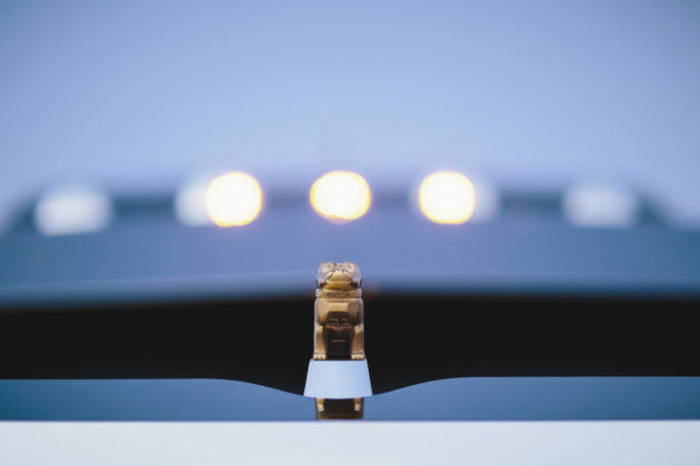
TORONTO, Ont. — In a patent application filed July 2, 1932, Alfred Masury wrote that he had invented “a certain new, original and ornamental design for an automobile radiator cap”, and that he was the sole owner of the work.
Masury, chief engineer at Mack Trucks at the time, was referring to the tiny bulldog he carved, a figure that would later adorn all vehicles from the American manufacturer.
It wasn’t by chance, though, that Masury chose the design of a bulldog. During World War I, thousands of Mack ACs were sent to Europe, where they soon became known for their dependability.
“British soldiers took note of the trucks’ blunt-nosed hood, tenacious performance and durability, which reminded them of the English bulldog,” said Christopher Heffner, manager of public relations at Mack.
It didn’t take much time before they nicknamed the Mack AC the bulldog, prompting the company to put an emblem on the side of its vehicles.
That logo was later replaced with Masuri’s carving on the hood, a symbol that is now synonymous with Mack.
“A gold bulldog indicates the truck was made with a Mack engine, transmission and drive axles. A chrome bulldog indicates other manufacturers’ components were used in the drivetrain,” said Heffner.
And Mack’s limited-edition black Anthem features a black bulldog, while the company has assigned a copper bulldog to its electric vehicles.
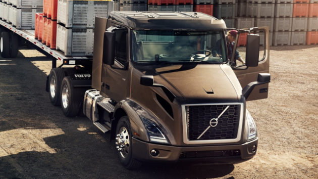
Volvo’s Iron Mark
Mack’s parent company, Volvo, has the bragging rights to one of the most famous vehicle symbols ever created.
Its iconic iron mark and diagonal slash were on the grille of the very first Volvo vehicle that rolled off the assembly line in Gothenburg, Sweden, in 1927.
The symbol is now on millions of trucks, automobiles and other equipment.
For Volvo, the diagonal slash was initially just a rod to hold the iron mark, which was held in high esteem because of the Swedish iron and steel industry’s reputation for quality.
“In order to attach the iron mark in the middle of the grille, the idea of creating a diagonal slash connected in each end of the grille was developed. Thus, what first seemed only to be a technical solution, ended up as the foremost identity carrier on all Volvo vehicles,” Volvo says on its website.
The design of the iron mark has evolved over the years, but the diagonal slash hasn’t changed much.
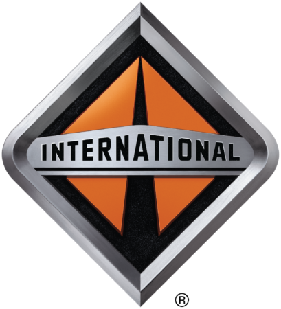
Navistar’s Diamond
Another famous trucking-related symbol is the diamond-shaped road logo on Navistar’s International brand of trucks.
“It is the image of a highway that seems to narrow and disappear as you look to the horizon,” said truck historian Dale Bridge.
Navistar’s predecessor, International Harvester, had a series of logos before the company settled on a version of the diamond in 1986 as it transitioned to Navistar.
Other well-known International symbols included the triple diamond introduced in 1925, and the man on tractor, created in 1944 by legendary industrial designer Raymond Loewy.
“This iconic graphic established itself as one of the best-known logos on the planet, along with the likes of Coca-Cola. At first used only on farm equipment, it eventually graced International trucks for decades,” said Tom Clark, corporate historian at Navistar.
But it wasn’t until 2001 that the company adopted the fully integrated badge, with “International” emblazoned on the diamond.
“Today’s diamond road logo, with its three-dimensional qualities, draws on all the rich heritage as it is proudly displayed on the front of today’s most modern line of trucks,” Clark added.
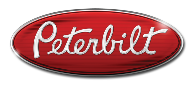
Kenworth’s KW and Peterbilt’s Oval
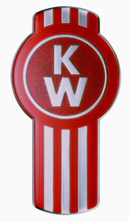
The Kenworth brand was created by combining the last names of Harry Kent and Edgar Worthington (Ken and Worth), who founded the company in Renton, Wash., in 1923.
“The vertical stripes on the KW bug emblem represent truck tire tracks,” said Jeff Parietti, public relations manager at Kenworth.
Over the years, the logo has gone through multiple incarnations. One version even included the slogan, “The World’s Best”, and another featured a swan on the emblem.
The symbol is now on every Kenworth truck.
Peterbilt, founded in 1939 by Theodore Peterman, joins Kenworth as a member of Paccar, formerly Pacific Car and Foundry.
Peterbilt’s red oval symbol was created in the 1950s when the company introduced the Model 351.
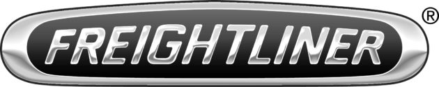
Freightliner
“Freightliner” was derived from Consolidated Freightways, the Portland, Ore., company that originally manufactured the trucks. The company later changed its name to Freightliner Corp.
In the 1950s, it teamed up with White Motor Co. of Cleveland, Ohio, to make co-branded trucks, known as “White Freightliner.”
“White” was later dropped from the name and logo, with the company sticking to just “Freightliner”.
Daimler Trucks North America (DTNA), a division of the German conglomerate Daimler AG, has owned the company since 1981.
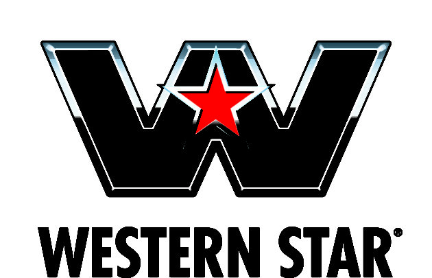
Western Star
The White Motor Co. began producing the Western Star brand of trucks in Kelowna, B.C., in 1967. The debut truck was the WS4900, originally known as the White Western Star. Embroidered “White Western Star” logo is now a collector’s item.
Its current logo is a red star on a large black “W”.
The ownership of the company has changed several times in the past three decades, and DTNA now owns Western Star.
Branding tools
Canadian branding expert Jeremy Miller believes the symbols embody a brand’s selling point.
“They become a vessel of personality and meaning, and take on the qualities that a company wants to portray,” said Miller, president of Toronto-based Sticky Branding, and the author Brand New Name.
For example, he said, the Mack bulldog personifies the tough, rugged nature of the trucks.
“Brand mascots are like fine wines; they get better with time… They have longevity, and that’s where their real value is derived,” Miller said.
“The more your customers interact and engage with a brand mascot, the more they know it, like it, and trust it.”
Have your say
This is a moderated forum. Comments will no longer be published unless they are accompanied by a first and last name and a verifiable email address. (Today's Trucking will not publish or share the email address.) Profane language and content deemed to be libelous, racist, or threatening in nature will not be published under any circumstances.
I am a HR driver in transporting people . I see in my travels particularly in the evening the glow of a shape which looks like a coffin ⚰️ or person from a distance on the front hood below a windscreen. Can you tell me more about it?
I read in this week’s People magazine (3/22/21) police are trying to solve a cold case murder from 1992. They are trying to locate info. on a semi truck, white with broad brownish, horizontal stripes across the side and cab doors (drawing in People magazine). I wonder if trucking magazines like yours could run an ad asking if anyone knows this logo. Your reader demographic may be best informed to help solve murder of a college girl.